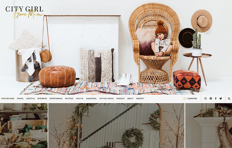
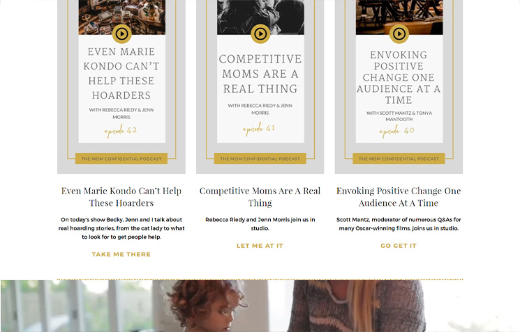
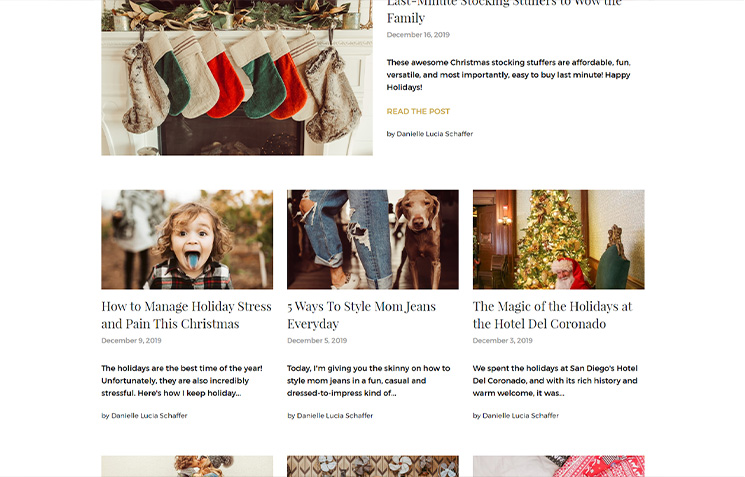
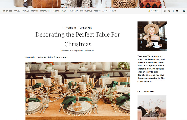
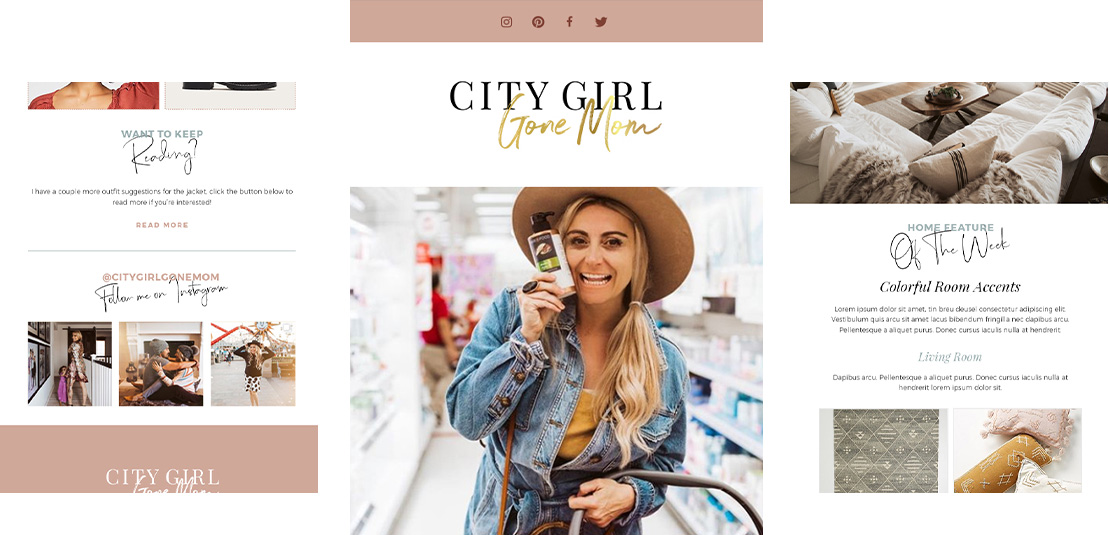
We further enhanced her site with beautiful, evocative images, graphics, and animations while keeping the layout and other web elements simple and navigable.
This created a perfect balance between functionality and creativity, which the old site fell short of.
While Danielle’s old website was a charmer (just like her), it needed a modern upgrade that was more in line with today’s digital audience and user demands. With the new site, users can get a glimpse of who Danielle is and what her publication is about from the get-go. Her readers can easily read or listen to her content without any traction. And more importantly, her site is now a stand-out amid a sea of mediocre blogs.
